It's that time of year again!! The time for giving, appreciating the little things, and all that is jolly and merry… Oh yeah, then there's the STRESS of figuring out what to give everyone!
We, here at Kim Armstrong ID, love and appreciate our clients so much, and always want to give them something heartfelt and meaningful. This year, we dug and dug for a truly genuine gift, and I think we managed to exceed our own expectations! With the help of Batter Up Cake Shop, located in Plano, TX, we created sugar shortbread cookies with custom frosting applied in the form of our client's favorite fabrics throughout their projects.
Take a look at some of these edible beauties!
Showing posts with label decorator. Show all posts
Wednesday, December 18, 2013
Monday, July 30, 2012
Just Wallpaper It
Wallpaper,
the
keystone to
creating a bold and vivid space, is making a dramatic comeback. We, here at Kim Armstrong Interior Design,
have a bit of a fetish for our statement-making friend. Here are some simple tips and
examples that can give life
to
any space.
Below are two photos of a room we recently designed using bright pops of pink and gray. As you can see in the “Before” photo, the room seemed nearly complete, but there was something not quite right. Finally (in the “After” photo), we concluded that the back wall needed a pop of pink in order to tie in all the blocks of color from around the room. The paper we chose was a subtle pink with a geometric pattern in a sheen. It doesn’t steal attention, it creates a better opportunity for all our custom pieces (like the headboard, bedding, and daybed) to be noticed.
BEFORE
![]() |
| By Kim Armstrong Interior Design http://interiorsbykim.com/ |
AFTER
![]() |
| By Kim Armstrong Interior Design http://interiorsbykim.com/ |
In
this next room, the wallpaper sets the tone of the entire space. It is apparent that whoever designed this
loft fell in love with the paper, and then designed around it. The space, while it looks complexly designed,
has a flawless and easy formula. They
picked the deep purple paper as the inspiration, chose a soft gray as their
main color, and added pops of a brighter purple for interest.
![]() |
| Source |
![]() |
| Source |
Now
that you’re an expert, I’m sure you can see the formula used here. The theme here seems to be what I would call
“colorful calm”. With the focus being on
the green bedding and big tufted headboard, the paper acts as the subtle
accent, pulling the space together.
Serenity at its best.
![]() |
| Source |
To sum it up, use a wallpaper which anchors the room’s eye-catching details. Some words of wisdom for picking that perfect
paper: if you know you want a big colorful print, pick it first so you can
build around it. If you know you want to
stay in the neutral
sector,
develop a room concept first, then pick the paper.
Labels:
bedrooms,
color,
contemporary,
custom furniture,
custom headboard,
Dallas,
decorator,
designer,
feminine rooms,
how to,
install,
Interior Design,
masculine rooms,
pink rooms,
pops,
Texas,
wall covering,
wallpaper
Tuesday, June 19, 2012
Beach House Bliss- Part I
The Blue Room- Galveston, Texas
Now that it's summer time, let's take a look at a beach house we designed last July. This is a perfect example that good design takes a really long time to go out of style, if ever.
The blue room, an unexpected attention grabber, is somewhat
similar to seeing a celebrity moseying down a suburban street. The alluring navy blue walls (Benjamin Moore-
Stunning 826) paired with cream, its extreme opposite, create quite a dramatic
spectacle.
The concept of this room was derived from the navy and
cream, floral duvet. Surprisingly, the
duvet, along with several other items like the art and rug, were purchased from
online auctions and discounted home stores.
Because we really needed a high impact punch against the dark wall, we
had the leather headboard custom made.
To really add a designer touch, we chose an affordable navy blue velvet
and cream nautical rope to make the Euro pillows. The Euros actually ended up being comparable
in price to a retail store, but happened to be exactly what we wanted. Tips in creating a space like this include
utilizing high contrast, mixing “splurge” and “save” items, and adding a few
customized touches.
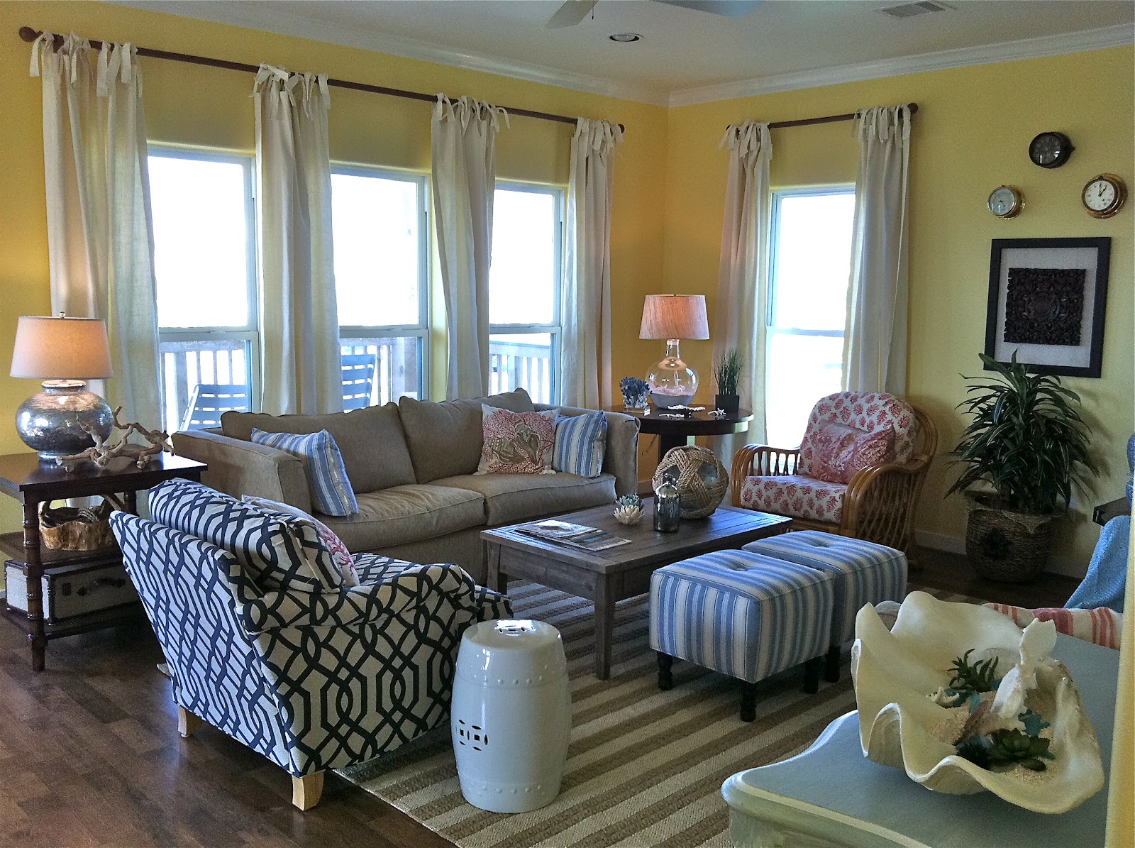
The Sun and Surf Living Room- Galveston, Texas
“Cozy, casual, easy living,” our client’s exact requests for
their beach house’s living room in Galveston, Texas. They originally planned on renting out the
residence, but after the initial reveal, they immediately decided to keep it
for themselves.
To get an easygoing vibe of this sort, it actually requires
a well thought out formula and inspiration.
The inspiration was not an object, but more of an idea to subtly bring
the sunny beach indoors. Understated
yellows and blues anchor the room, while custom-made linen drapes, pops of red,
and different wood tones add interest. Our
favorite and most innovative element of the room happens to be the six framed
prints of sea animals and birds. The
“prints” were actually pages from a book that we had framed and matted; they
flow perfectly with the opposing beach view.
Although there are tons of elements within one space, we had
to formulate a sense of balance between them all. Instead of seeing each individual piece, you
see one unified room that screams, “Come relax!”
Labels:
beach,
bedroom,
blue,
bright,
colorful,
custom,
Dallas,
decorator,
drapes,
furniture,
Galveston,
HGTV,
house,
Interior Design,
Kim Armstrong,
living room,
nautical,
Texas,
transitional,
yellow
Location:
Galveston, TX, USA
Thursday, June 14, 2012
Favorite Finds
1. KAID is all about creating a
space based on functionality and aesthetics. Often times, more expensive products are of better quality and visual appeal, but we do not
discriminate on saving money if it's the right choice! For example, this yellow, floral tufted bath mat is from
none other than Target!
2. These are some hand-crafted
tiles from the Kibak collection, sold at Ann Sacks. They feature historically correct, brightly colored, and interesting designs.
3. This hand-made Currey and Company chandelier would be the focus of any room. With the main body made of turquoise beads accompanied by jade accents, it's like hanging
a piece of jewelry from the ceiling. The classic shape paired with bright colors makes it fitting for tons
of today's interiors.
4. This fabric, featuring
cameos of brunette mademoiselles, is one of our absolute favorite textile
designs. The exquisite colors and natural fibers (cotton and linen) make it
a luxury to the eye and to the touch. Don't worry boys, we do have an eye for masculinity, too.
5. Turquoise and and antique
aesthetic. It doesn't get much better
than that. This antique chest of drawers, manufactured by Guildmaster, is one of KAID's favorite
pre-made case goods of the year.
6. Whether you want to eat in
style or embellish your walls and shelves, these Anthropologie ceramic plates are the way to go. Mix
and match your heart out!
If you're interested in purchasing any of these products please contact Kim Armstrong Interior Design at (214) 500-0600, or e-mail us at kim@interiorsbykim.com.
Subscribe to:
Posts (Atom)