Showing posts with label Interior Design. Show all posts

Tuesday, December 10, 2013

Color for the New Year

So, I know we've been gone a while, but it's time again to share our interior design insider knowledge!  Recently, we took a trip to High Point Market, the largest home furnishings industry trade show in the world!  We covered (or tried to cover) over 10 million square feet filled with the latest and greatest products in home furnishings.  Needless to say, we were  exhausted and exhilarated by all the new products and upcoming trends we discovered.

As you may know, we here at Kim Armstrong Interior Design are avid color lovers… like we seriously have an addiction to the point that we coined the word, "colordiction"!  So, obviously, the color trends from High Point are the first things we'd like to share with you.

Everywhere we turned, there were variations of blue.  Ranging from aqua to navy, the stunning cool hue definitely stole the show!  Although emerald and kelly greens have been popular for quite some time, it doesn’t look like they are bowing out just yet.  Believe it or not, one of our favorite color pairings were none other than NAVY AND EMERALD GREEN!  Such a fun and classic combo.


Purple, plum, lavender, or whatever you want to call it, was pretty high up on the color radar.  It didn’t rear it’s head quite like the blue shades did, but we expect it to get more and more popular in the upcoming year.  Last, but not least, pops of orange are coming into the forecast.  It definitely wasn’t as prominent as the others, but was used here or there for a fiery flare.


Wednesday, September 19, 2012

Trending- Faux Bois Is the New Floral

Who is sick of chevron patterns and florals!?  Well, I'm not quite sick of them, but I must say I'm excited for a new pattern to get some hype!  Faux bois, from the French for false wood, is just that, imitation of a wood grain on different sorts of media (http://en.wikipedia.org/wiki/Faux_bois).  

Recently featured in Elle Decor as a hip new print, I will bet big money that it'll be all over the shelves by Spring in extremely awesome hues.  So, luck you to get the heads up!  Go grab some faux bois before everyone has it!  Check out these products I've found below... faux bois oohhh la la!   
 

1.  Fake wood print acryclic accent table- Find it HERE

2.  Faux bois rug- Find it HERE

3.  Printed wood lamp shade- Find it HERE

4.  Velvet faux bois fabric in blue- Find it HERE

5.  Textural fake wood pillow in gray- Find it HERE

6.  "Knock On Wood" Print- Find it HERE

Monday, September 10, 2012

Bohemian Bedroom and Tone on Tone Theater Room

Here are some room concepts we are preparing to bring to life for a client here in Dallas, Texas.  Kim Armstrong Interior Design developed these spaces through a detailed interview process and a customized questionnaire.  While this images are just a taste of what the finished products will be, these digital designs really help people visualize how the elements will relate.  It's also a lot less time consuming than doing a hand or computer-generated rendering!

Here is a Bohemian bedroom design with focus on having a place for everything.  Organization and clutter free design are always a must no matter what style you're going for.  We created storage in unique ways like putting shoes in the china hutch, using an old vintage desk as a makeup vanity, and attaching lace to ornate frames for jewelry display.

This tone-on-tone media room was designed with a masculine feel, but no woman would turn down watching a movie in this space.  By keeping the color minimal (on pillows and a chair) the rest of the room generates warmth with its color palette of grays, browns, tans, and creams.  Because the space's purpose is to watch movies, the focus should not be the rooms aesthetic, but to bring family and friends together to enjoy movies, reading, and each other's company.


Friday, August 17, 2012

Interior Design Online

As we all know, it's 2012 and the internet is taking over pretty much every industry out there.  From ordering pizza, clothing, groceries, etc., a consumer can pretty much get whatever they want from the good ol' world wide web.  Interior design is not exception!  Tons of designers are evolving to the technologic changes, therefore, marketing towards online interior design.  One of those design firms happens to be yours truly!

While we primarily do the hands on approach with design, we have been implementing some designs digitally.  This process comes in packages depending upon the details of the project.  So, here is a step-by-step system of how we design online.

1.  We ask you a series of questions through e-mail
2.  We have you measure the room and your existing furniture, etc.
3.  From looking at the measurements you sent us, we create a floor plan
4.  We tell you where to take pictures from.... You will have to take TONS of pictures because we won't be able to see it in person
5.  After those initial steps, we get started on the preliminary design concept
6.  We will first send you several digital design board options through e-mail
7.  If your project is more than furnishing and require demolition or customizations, we can help you find tradespeople in you area.
8.  Once we've figured out the perfect design for you, we will help you in ordering product and getting everything completed properly.

While it is more hands on for you, the client, it will usually be less expensive and you can do it all from the comfort of your own home.  Also, you don't have to live in the Dallas area, or even the Texas area, because we can assist you wherever you are!

Here are some examples of digital boards we've done!!  If you like any of these boards and/or would like more information on KAID's Online Design, e-mail us at kim@interiorsbykim.com.

Bohemian Living Room... If you like it, let us know!!

Funky Formal Dining Room

Masculine Office Space


Tuesday, August 14, 2012

Chevron and On and On....


While taking interior design CEU classes at Metrocon, a large conference for designers in Dallas, Texas, I noticed a ton of so-called fashionistas roaming the halls.  The ladies, and occasional dressed-to-the-nines man, who stood out were the ones dressed in black and white chevron patterns.  The most eye-catching of the chevron trenders were the ones who paired their black and white zig zag with an equally bold accent color.

Because I LOVE chevron patterns used in interiors, I thought, what better way to connect fashion and interior design than to blog about this pairing.  It's no secret that home design and fashion trends go hand in hand, just ask the chevron expert, Missoni, whose patented chevron clothing and home goods were and still are a craze.  

Just for effect, I've put together some images displaying the coalition of chevrons in home vs. chevrons on body.  Remember, this doesn't just apply to the chevron pattern; keep an open mind to translating interiors to fashion and vice versa.

Source

Source

Source

Source

Source

Monday, July 30, 2012

Just Wallpaper It


Wallpaper, the keystone to creating a bold and vivid space, is making a dramatic comeback.  We, here at Kim Armstrong Interior Design, have a bit of a fetish for our statement-making friend.  Here are some simple tips and examples that can give life to any space. 

Below are two photos of a room we recently designed using bright pops of pink and gray.  As you can see in the “Before” photo, the room seemed nearly complete, but there was something not quite right.  Finally (in the “After” photo), we concluded that the back wall needed a pop of pink in order to tie in all the blocks of color from around the room.  The paper we chose was a subtle pink with a geometric pattern in a sheen.  It doesn’t steal attention, it creates a better opportunity for all our custom pieces (like the headboard, bedding, and daybed) to be noticed. 

BEFORE 

By Kim Armstrong Interior Design
http://interiorsbykim.com/

AFTER

By Kim Armstrong Interior Design
http://interiorsbykim.com/


In this next room, the wallpaper sets the tone of the entire space.  It is apparent that whoever designed this loft fell in love with the paper, and then designed around it.  The space, while it looks complexly designed, has a flawless and easy formula.  They picked the deep purple paper as the inspiration, chose a soft gray as their main color, and added pops of a brighter purple for interest. 
Source


Here’s another example of keeping things simple while creating a to-die-for look.  They chose a foil based paper with a contemporary print; it reads pretty neutral which leaves opportunity for color to be incorporated.  In keeping the bedding and décor
modest, this allowed for bright pops of yellow from the lamps, which really grab your attention.

Source

Now that you’re an expert, I’m sure you can see the formula used here.  The theme here seems to be what I would call “colorful calm”.  With the focus being on the green bedding and big tufted headboard, the paper acts as the subtle accent, pulling the space together.  Serenity at its best.
Source


To sum it up, use a wallpaper which anchors the room’s eye-catching details.  Some words of wisdom for picking that perfect paper: if you know you want a big colorful print, pick it first so you can build around it.  If you know you want to stay in the neutral sector, develop a room concept first, then pick the paper.


Friday, July 27, 2012

The Pink and the Gray

Well, this might be a bit premature, but I have to share our most recent work here at Kim Armstrong Interior Design.  We haven't gotten these professional photographed, but you can very much appreciate the design and customizations by my awesome I-phone photos.  Enjoy, and of course, what do you think!??
This photo is actually professionally done.  The chair and vanity are both completely custom, designed by KAID.  This photo was taken by Kim Burnstad (who is AMAZING!)  Please visit her website at kbbphotography.com


Like I said, I-phone photo, but you can see how delicious this room is.  Custom headboard, daybed, bedding, and frames!  All done by yours truly, Kim Armstrong ID

Ms. Wilma's favorite spot in the house.  She blends nicely :)
Wall of custom frames with family photos.  It doesn't get much more beautiful/heartfelt than that.

Monday, July 23, 2012

Wonder Wall


Decorating your walls can kinda be like writer's block.  You know, that empty, frustrating feeling of nothingness?  

People want their spaces to feel special and personal, but not every item can have deep, warm-your-heart meaning.  If you are suffering from the “blank wall blues”, here are a couple of ways to add some oomph to your space.  Even if you don’t decorate with Grandma’s heirlooms or award winning art pieces, at least make it look like it :)

The arrangement of six frames on the back wall are none other than... pages from a book!  This was a coastal themed beach house in Galveston, Texas, so we found a book with sea animals and birds and had a local frame shop frame and matte them for us.
source of above photo

Framed and matted intaglios look super rich and classy.  You can get them made of plaster, which is inexpensive.  Do spend money on good framing, it is soooo worth the look you will get.
Close up of intaglios
source of above photo


Have tons of digital photos?  Alter the coloring to be black and white or sepia tone and print them out at your desired size.  Most frame shops or Kinko's can help you to do that.  Creating a symmetrical arrangement like the one featured above can create such a strong element to any space.
source of above photo


Who loves thrift store shopping?  Check out your local thrift/consignment/and even garage sales to find some old vintage frames.  Paint and distress them yourself, then hang them EMPTY.  Yes, let the frame be the art.
source of above photo

Wednesday, July 11, 2012

Doors We Adore


These doors really “light my fire", as Jim Morrison would say.  If you really want to spruce up your home’s curb appeal, think about painting your front door or getting a unique style/material of door.  Check out some of my colorful, funky finds. 

Just for further proof, I do practice what I preach.  My office door happens to be an electric pink (first photo below), and my home has a soft yellow front door to accent its gray main color.

If you’d like any of these doors custom made just for you, feel free to contact us at kim@interiorsbykim.com, or (214) 500-0600.

If you’d like to get down and dirty and DIY, here’s a quick step by step guide of how to paint your own door.

1.     Take your door off!!  Trust me, just do it… it will be much easier in the end.
2.     Remove all the hardware (knobs, hinges, peep holes, etc.)
3.     Tape off any exposed glass
4.     Prime the ENTIRE door.  Even under where the hardware was!
5.     Wait for the primer to dry, then fill any cracks with caulk.  Once caulk is dry, prime over it.
6.     Sand with a fine grit sandpaper.  This will really make the door look expertly done.
7.     Sweep off all dust and residue, and PAINT the door!  If you want to spruce up the interior of your home (and the color you’ve chose melds with your interior spaces), paint the inside, too.
8.     Use a roller on the flat parts, and a brush to get into the crevices.  You will probably need to do several coats.  Make sure you let each coat dry before doing a new one.
9.     Apply the door, and viola, facelift accomplished!

KAID's office door.  Does it look familiar?

Pink and stucco 

Yellow and etched glass design

Mod and masculine, navy blue

Traditional goes orange


The weathered look.  We can show you how to get a finish like this


It's like a bag of skittles
http://darlingdarleen.blogspot.com/2012/03/colorful-front-door.html
    

For those a little frightened of color, try a beautiful mahogany or maple with a warm stain


Rustic, yet modern


Tuesday, July 10, 2012

HGTV Coastal Images

Exciting news today!  KAID was featured on HGTV for our beach house designs.  They created a category on their site for "Coastal Inspired Bedrooms" and featured THREE of our photos!  Check them out, they are images 11, 16, and 17.

http://www.hgtv.com/bedrooms/coastal-inspired-bedrooms/pictures/index.html


Wednesday, June 27, 2012

Boyish Charm

KAID loves doing the "bachelor pad" look.  The key is to find awesome staple pieces and build around them. 


Here is an awesome, masculine living room we did in Houston, Texas. We kept the furniture a bit on the contemporary side, but used warm earth tones and heavy textures to make it comfy. Also, an antique map, such as this one, is a great way to add a masculine piece of art without spending a fortune.


Here we furnished a high rise condo in Dallas, Texas.  Our client wanted to keep things simple with pops of color and midcentury modern furniture.  For a touch of awesome, we had the vintage chrome tub chair recovered in custom fabrics.


Close up of our vintage creation.

Tuesday, June 19, 2012

Beach House Bliss- Part I

The Blue Room- Galveston, Texas


Now that it's summer time, let's take a look at a beach house we designed last July.  This is a perfect example that good design takes a really long time to go out of style, if ever.


The blue room, an unexpected attention grabber, is somewhat similar to seeing a celebrity moseying down a suburban street.  The alluring navy blue walls (Benjamin Moore- Stunning 826) paired with cream, its extreme opposite, create quite a dramatic spectacle. 


The concept of this room was derived from the navy and cream, floral duvet.  Surprisingly, the duvet, along with several other items like the art and rug, were purchased from online auctions and discounted home stores.  Because we really needed a high impact punch against the dark wall, we had the leather headboard custom made.  To really add a designer touch, we chose an affordable navy blue velvet and cream nautical rope to make the Euro pillows.  The Euros actually ended up being comparable in price to a retail store, but happened to be exactly what we wanted.  Tips in creating a space like this include utilizing high contrast, mixing “splurge” and “save” items, and adding a few customized touches.


The Sun and Surf Living Room- Galveston, Texas


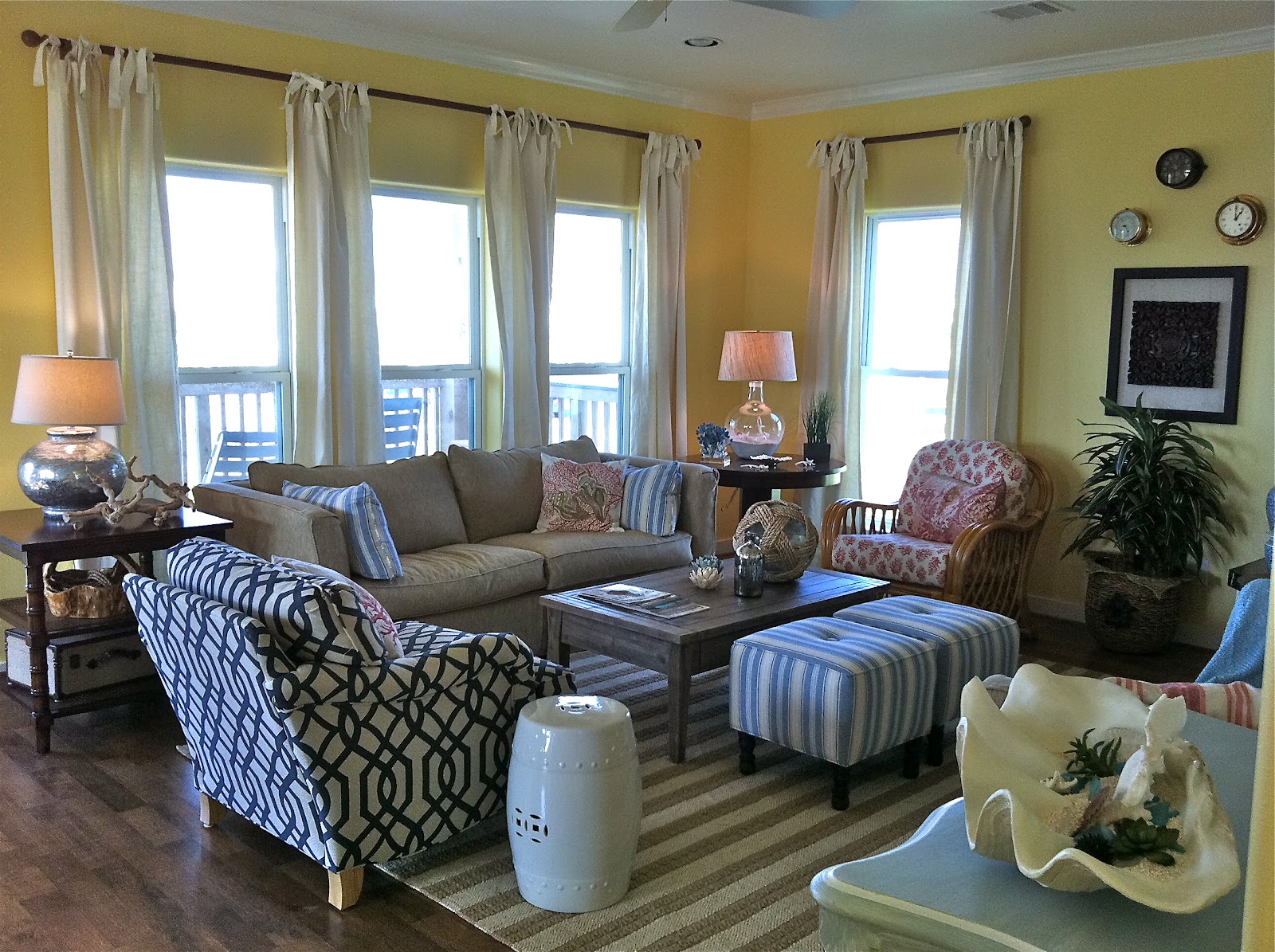
“Cozy, casual, easy living,” our client’s exact requests for their beach house’s living room in Galveston, Texas.  They originally planned on renting out the residence, but after the initial reveal, they immediately decided to keep it for themselves. 

To get an easygoing vibe of this sort, it actually requires a well thought out formula and inspiration.  The inspiration was not an object, but more of an idea to subtly bring the sunny beach indoors.  Understated yellows and blues anchor the room, while custom-made linen drapes, pops of red, and different wood tones add interest.  Our favorite and most innovative element of the room happens to be the six framed prints of sea animals and birds.  The “prints” were actually pages from a book that we had framed and matted; they flow perfectly with the opposing beach view.

Although there are tons of elements within one space, we had to formulate a sense of balance between them all.  Instead of seeing each individual piece, you see one unified room that screams, “Come relax!”

Thursday, June 14, 2012

Favorite Finds


1.  KAID is all about creating a space based on functionality and aesthetics. Often times, more expensive products are of better quality and visual appeal, but we do not discriminate on saving money if it's the right choice! For example, this yellow, floral tufted bath mat is from none other than Target!
2.  These are some hand-crafted tiles from the Kibak collection, sold at Ann Sacks. They feature historically correct, brightly colored, and interesting designs.
3.  This hand-made Currey and Company chandelier would be the focus of any room. With the main body made of turquoise beads accompanied by jade accents, it's like hanging a piece of jewelry from the ceiling.  The classic shape paired with bright colors makes it fitting for tons of today's interiors.
4.  This fabric, featuring cameos of brunette mademoiselles, is one of our absolute favorite textile designs. The exquisite colors and natural fibers (cotton and linen) make it a luxury to the eye and to the touch. Don't worry boys, we do have an eye for masculinity, too.
5.  Turquoise and and antique aesthetic.  It doesn't get much better than that.  This antique chest of drawers, manufactured by Guildmaster, is one of KAID's favorite pre-made case goods of the year.
6.  Whether you want to eat in style or embellish your walls and shelves, these Anthropologie ceramic plates are the way to go.  Mix and match your heart out!

If you're interested in purchasing any of these products please contact Kim Armstrong Interior Design at (214) 500-0600, or e-mail us at kim@interiorsbykim.com.